Is the World Becoming Less Happy
information design
Target audience
The primary audience for this project was Gen Z in North America. I aimed to connect with people around my age who often express a sense of pessimism about the state of the world. Growing up, we’ve been constantly exposed to headlines suggesting that the world is only getting worse. That’s why I felt Gen Z would be the ideal audience for a project centred on the World Happiness Report; to challenge that mindset and offer a more nuanced, global perspective on well-being.
Aim
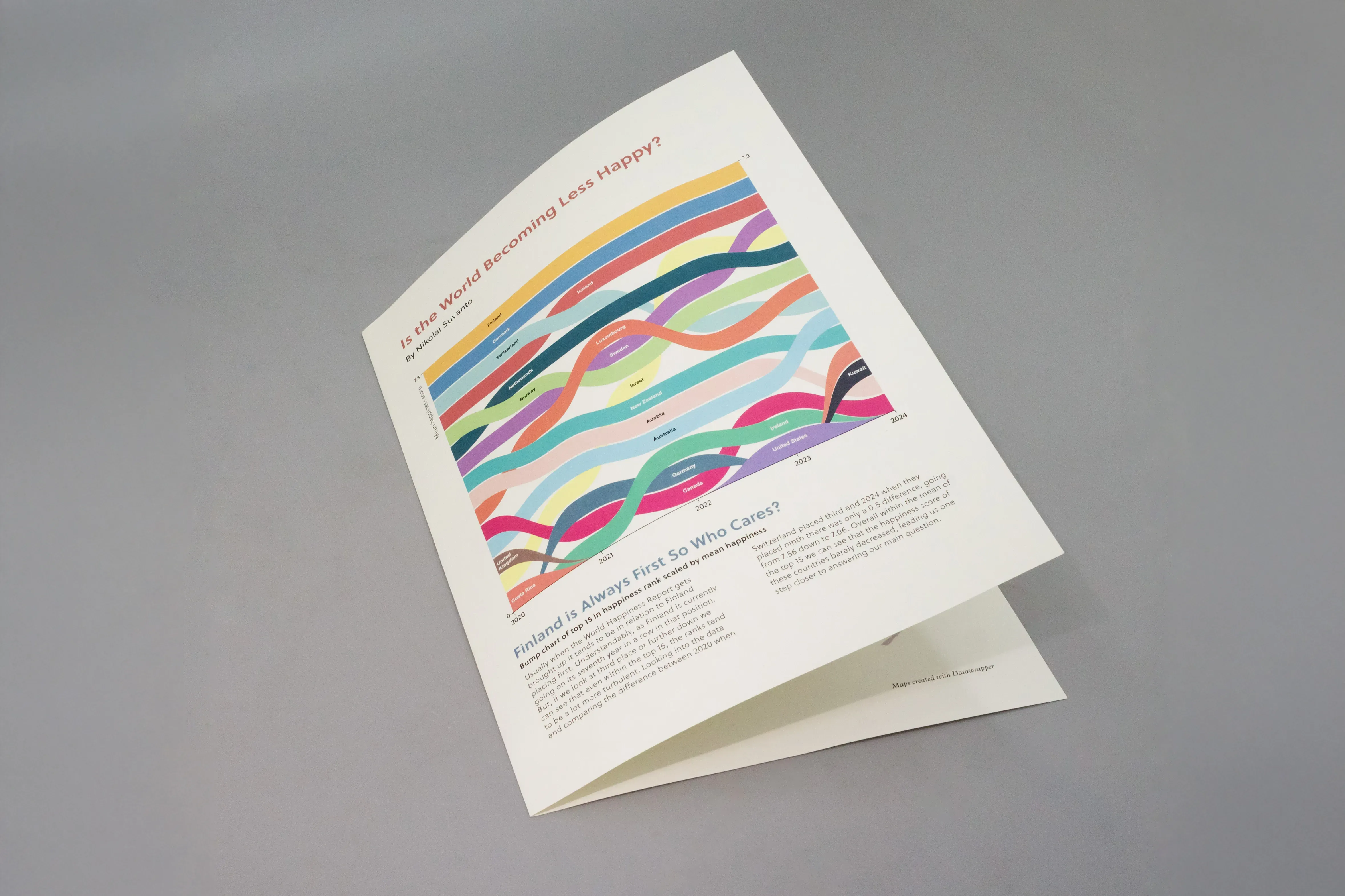
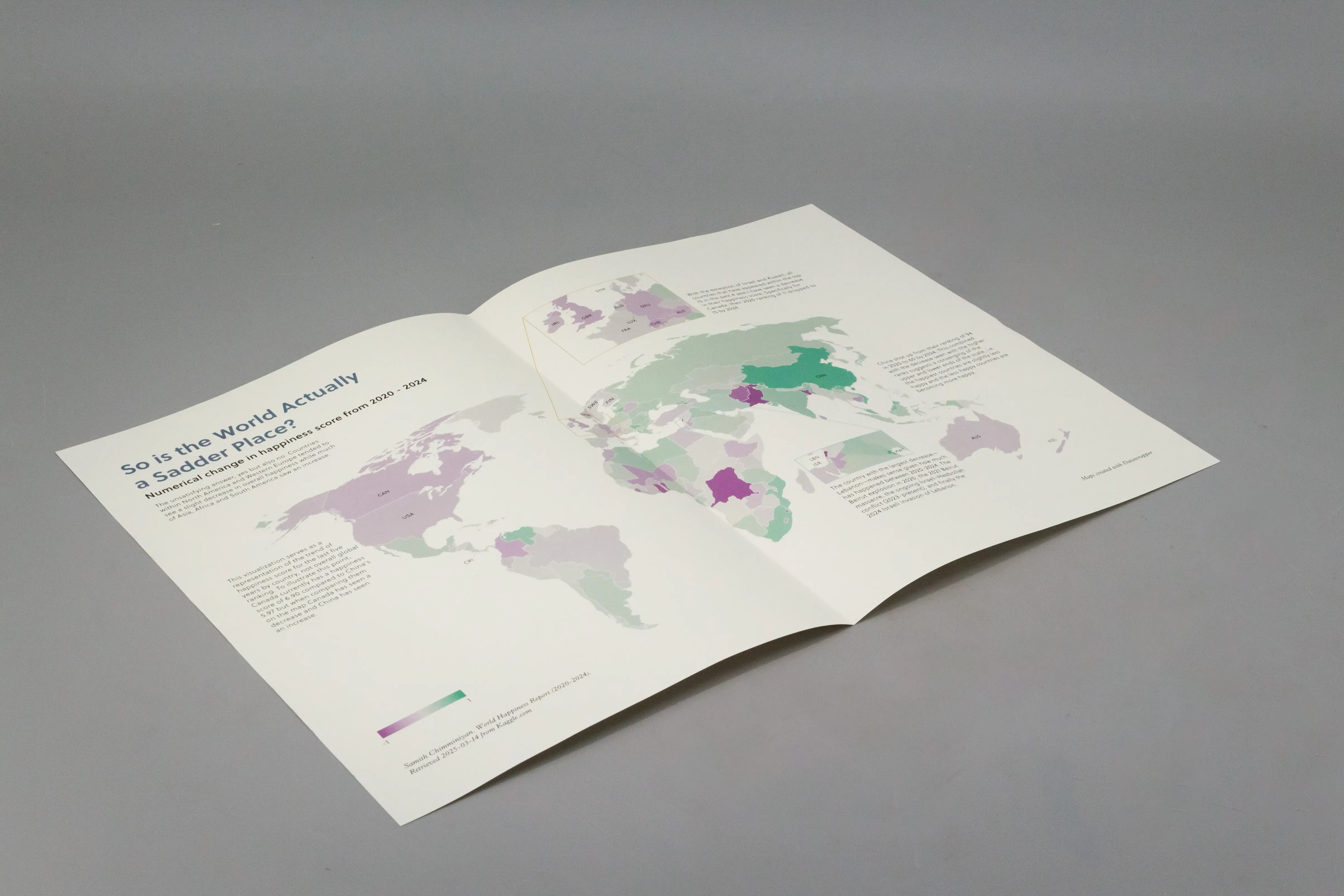
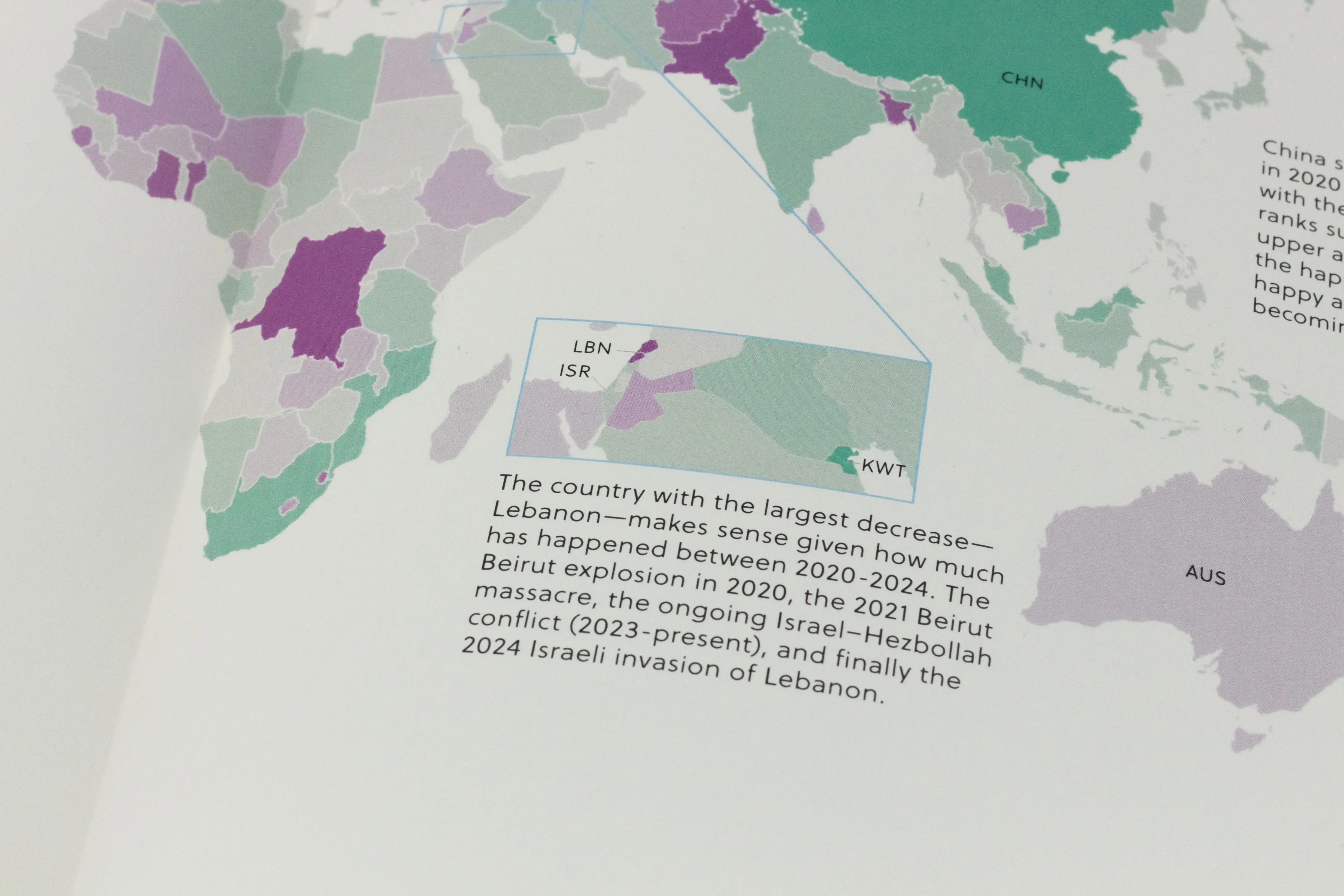
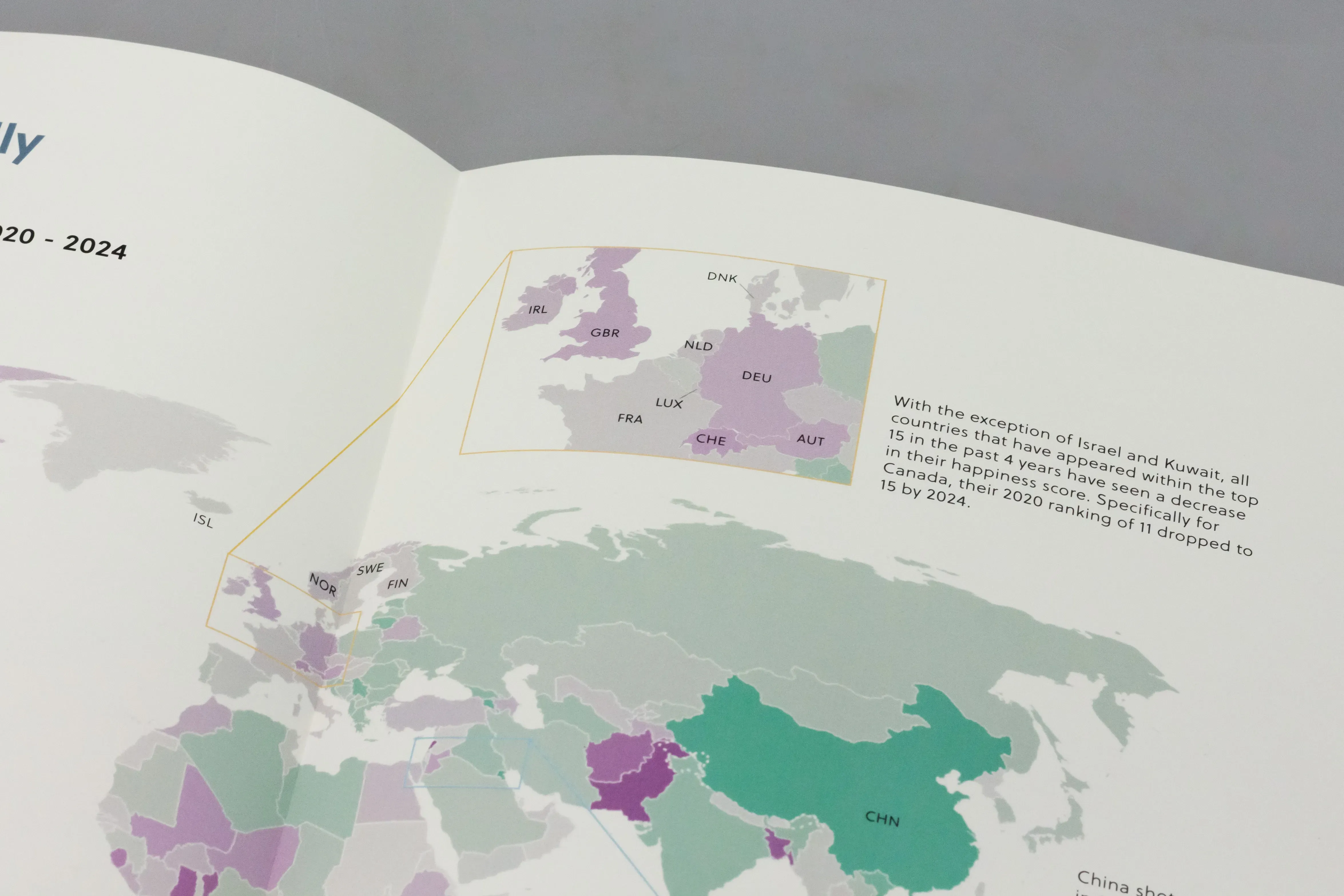
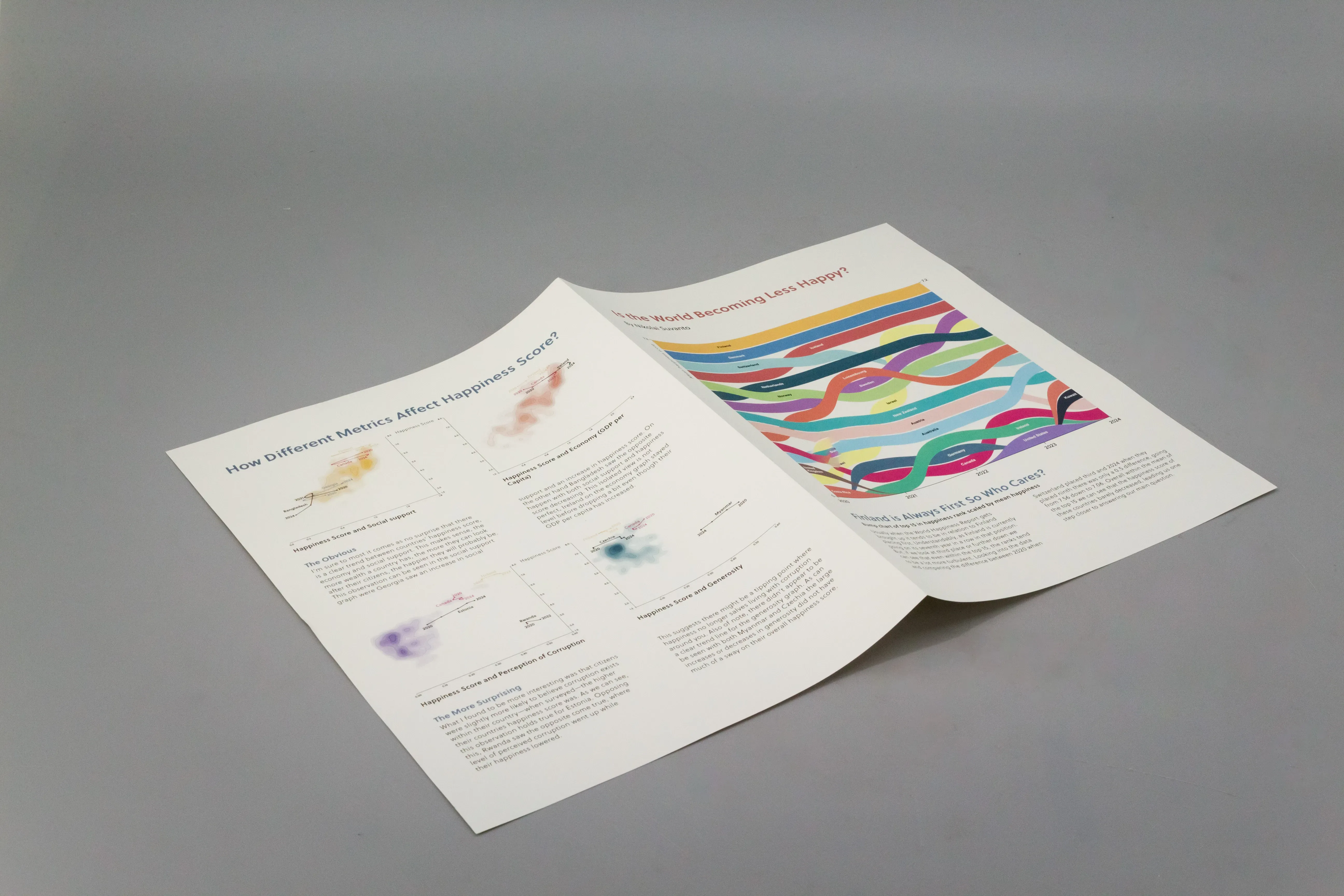
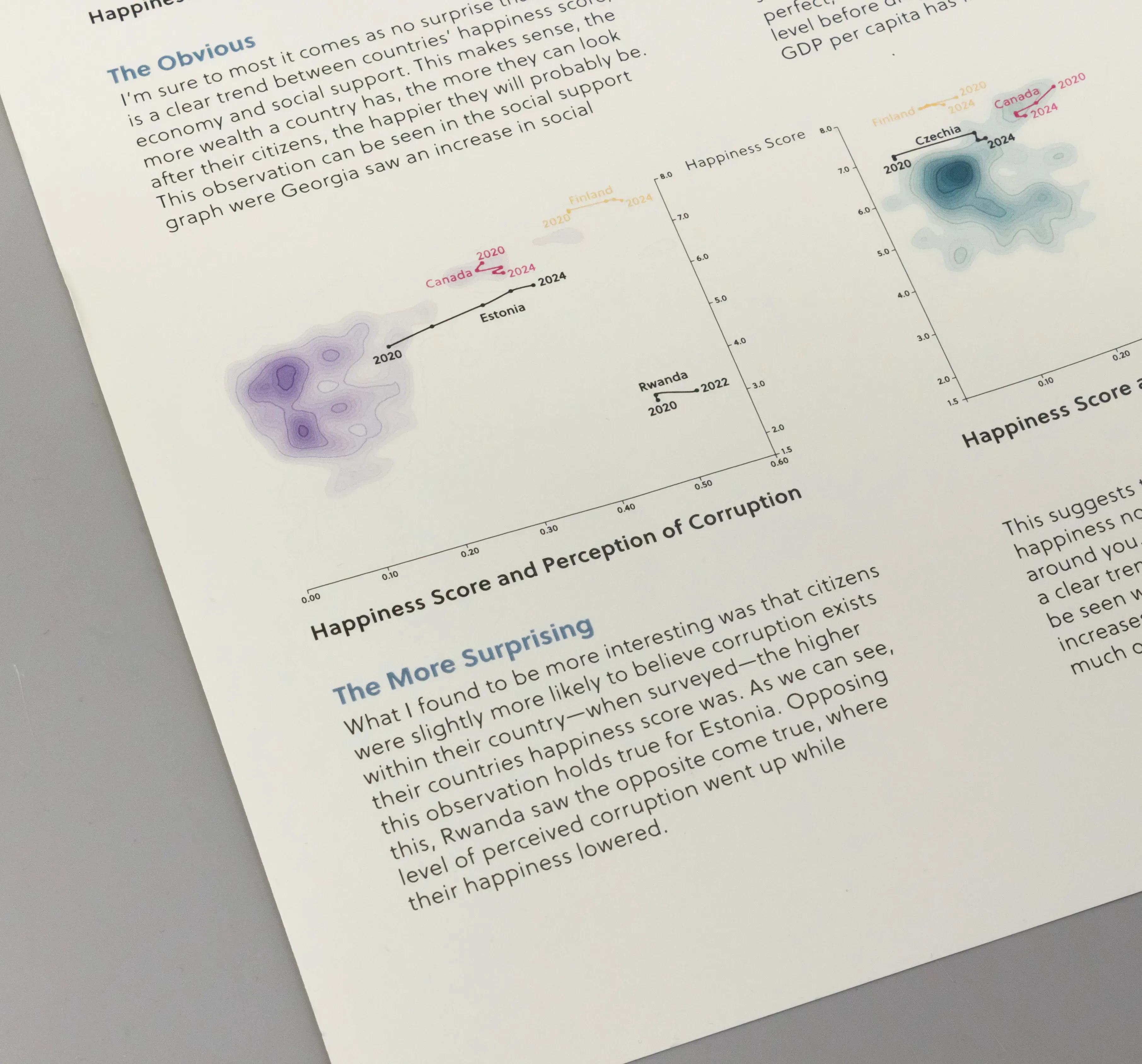
The strategic objective of this project was to explore whether the world is truly becoming a less happy place, particularly focusing on speaking to Gen Z, who often express pessimism about the future. Using data from the World Happiness Report, I aimed to create visualizations that could challenge this narrative or offer a more nuanced, global perspective. Three complementary visualizations were designed to balance specificity with broad insight: a bump chart focusing on the top 15 happiest countries over time, a world map providing a wider view and showing relative changes across all countries, and a contour/connected scatter plot examining correlations between happiness and factors like GDP, social support, and corruption, while also highlighting countries of note, Canada and the country ranked #1—Finland.
The additional text throughout the project did not treat the World Happiness Report as rigid truth; it also highlighted the report’s limitations and areas where the data falls short, encouraging critical engagement with the dataset. Special care was taken to represent the data thoughtfully, avoiding oversimplification and acknowledging the complexities behind the numbers, especially when discussing real people and places. Highlighting how stats and news might not provide the most clear picture was important given my target audience and the narrative they have already been fed throughout their younger years.